
I presented the Data Graphic Icon Sets in Visio Professional in last month’s blog post, so this month is an exploration of the Data Graphic Data Bars feature.
Like icons, data bars can be used on shapes to indicate the presence of different data values within them, but they can also display amounts with varying size graphics. Moreover, some of the data bars can display multiple values side-by-side within the same graphic item.
Deciding on the Example Data
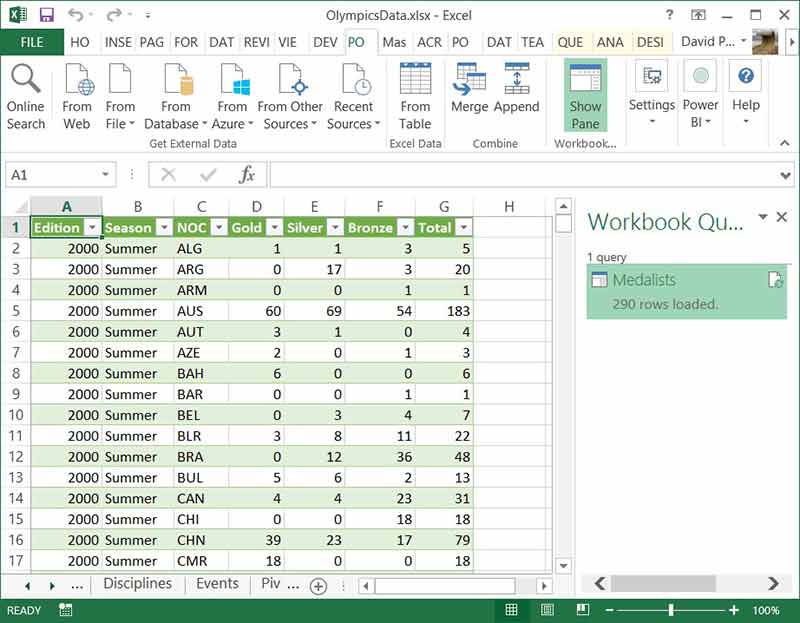
I will need some example data to display data bars for, and there is a useful Excel workbook of Olympics medal winners on Codeplex at https://msftdbprodsamples.codeplex.com/releases/view/97636 . I created a table in Excel 2013 using PowerQuery to list the medals won per year since 2000 in the summer and winter Olympics.
Creating Shape Data Rows
I used the Link Data to Shapes feature of Visio Professional (which will be the subject of a future article) and used it to automatically create Shape Data rows on a simple rectangle, into which I used INSERT \ Field to simply display customized text on the rectangle from three of the Shape Data row values. The custom formula that I used was:
=Prop._VisDM_Edition & "/" & Prop._VisDM_Season & " : " & Prop._VisDM_NOC
*Note that the _VisDM_ prefix to the Shape Data row names is a feature of the Link Data to Shapes function.
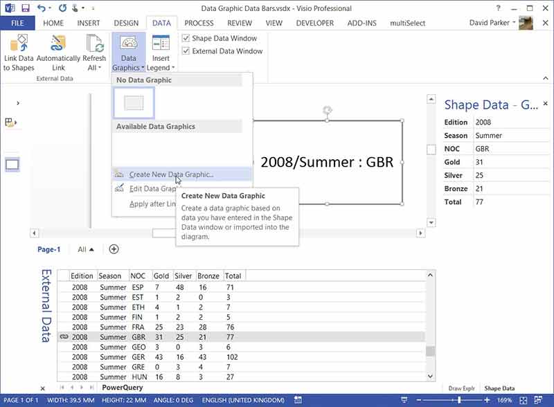
Creating Data Graphics
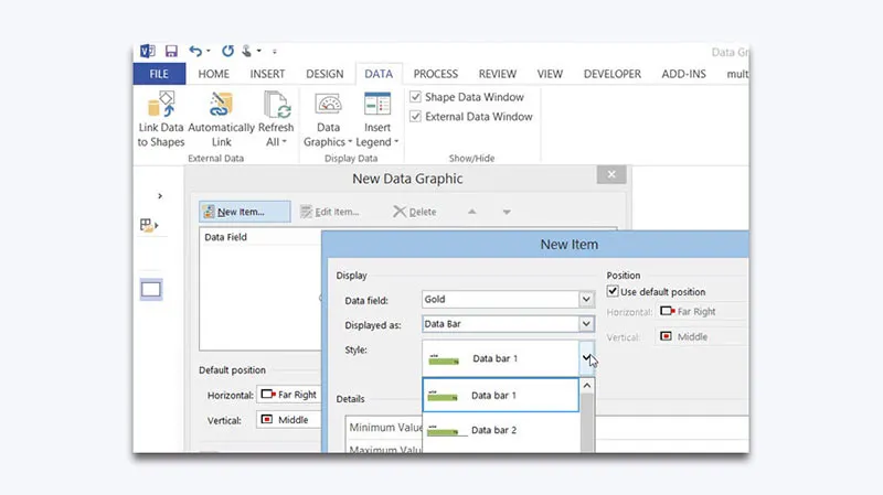
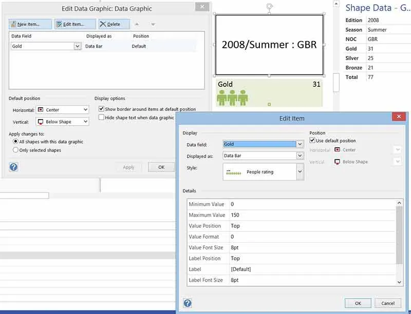
Here I clicked New Item on the New Data Graphic dialog, where I then chose Gold from the Data Field drop-down list, and selected Data Bar in the Displayed as dropdown. I then reviewed the available built-in data bar styles.
Single Value Data Bars

I decided that the People rating style was the most appropriate for the winners of gold, silver and bronze medals.
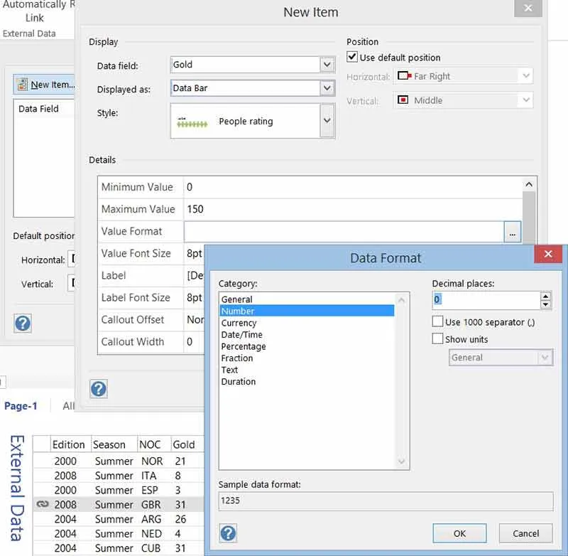
The Details panel then displays the appropriate properties for the selected style, some of the common properties for data bars are the minimum and maximum values. I assumed that no country had a minus number of medals, and I noticed that no country has won more than 140 medals of a single type in any Olympic Games, so I set the minimum to 0 and the maximum to 150.
I also checked that the only whole numbers would be displayed using the Data Format dialog that is opened with the builder button at the far right of the Value Format box.
I decided to select Top for both the Value Position and Label Position settings.
I repeated the above process for the Silver and Bronze Shape Data rows, displaying all three at the Default position that I changed to Center \ Below Shape. I also ticked the Show border around items at default position for an extra background to these data bars.
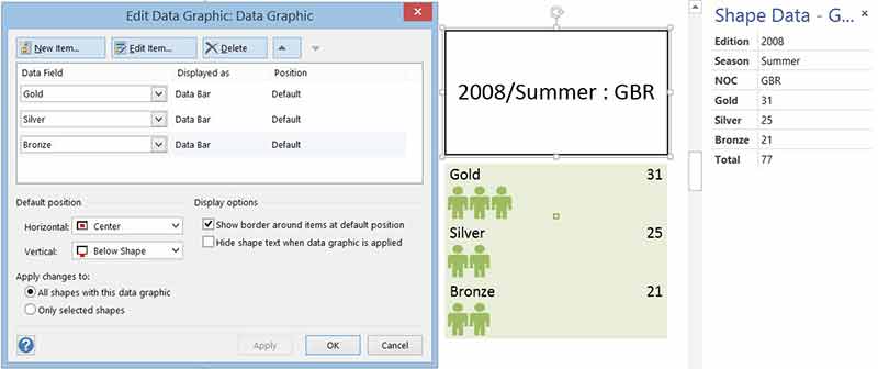
Now, the default fill color of each of these three data bars was the same, so I selected each data bar and assigned a fill color more appropriate for gold, silver and bronze.
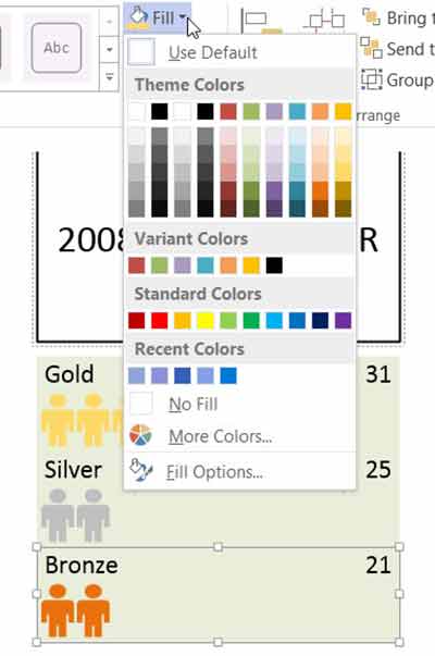
I wanted to prevent theme colors from being applied to these particular shapes, and so unticked Allow Themes on the HOME \ Shape Styles dropdown with each one selected.
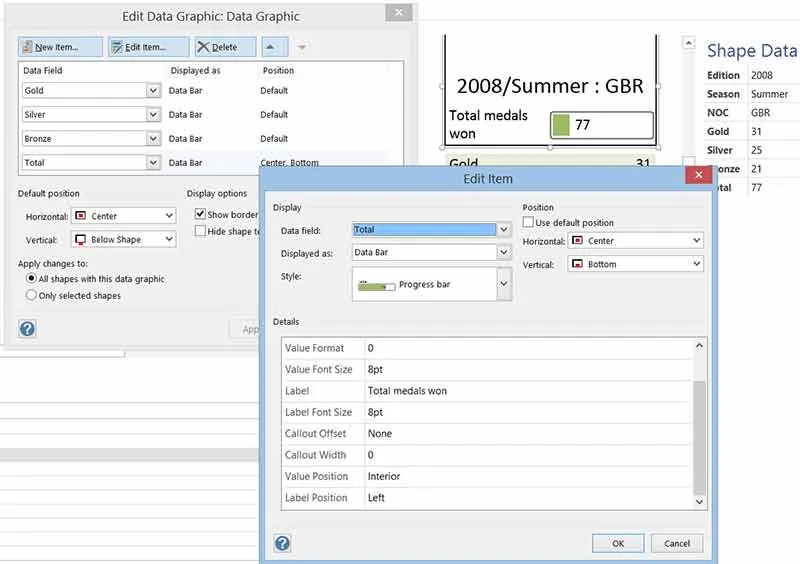
Next, I added a Progress bar item at the Center/Bottom for the Total Shape Data row. Its properties are practically identical to those of the People rating style. However, I decided to edit the Label to read Total medals won rather than just Total:
Multiple Value Data Bars
Finally, I decided to display a Stacked Bar 1 style to display the relative size of the number of gold, silver and bronze medals along the top of the shape. There are two other built-in data bar styles; Stacked bar 2 and Multi-bar graph, that can display the values from multiple Shape Data rows simultaneously.
At first, I was going to display the percentage of the total for each medal type, but then I noticed that some countries won very few to none of one type of medal. There was therefore no room to display any characters in these particular boxes, so I eventually decided not to display either value or label. I did however leave in my original formulas for calculating the percentage because their relative sizes would still be the same.
There is a More fields … option at the end of the Data field dropdown which enabled me to enter a Custom formula, such as:
={Gold}/{Total}
The braces surround a Shape Data label, and are equivalent to typing:
=Prop._VisDM_Gold/Prop._VisDM_Total
In fact, all of Visio’s ShapeSheet functions are available to use, except those which require user-interaction.
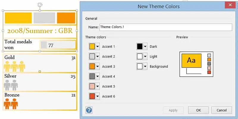
Using Themes
I was not happy with the default colors provided for the Stacked bar 1 item, so I edited a theme:
DESIGN \ Variants \ Colors \ Create New Theme Colors
…in order to select appropriate values for Accent 1, 2 and 3 which are used by the first, second and third box of the Stacked bar 1 shape.
I then made a few more tweaks to font colors and displayed the data of several different countries in duplicates of my original shape.

Consequently I was then able, at a glance, to see the relative number of medals won at the 2008 summer Olympics.
Summary
In this article, I have shown how to use the Data Graphic Data Bars with shapes that have Shape Data, and how to vary the colors used within them. These data bars are just normal Visio shapes, and it is possible to make custom data bars with standard vector geometry. This will be the subject of a future article.

.webp)