
My previous two articles were about Data Graphic Icon Sets and Data Bars in Visio Professional, and the theme is continued this month with the Data Graphic Text feature, and I also use the final Data Graphic type, Color By Value.
Like icons and data bars, text callouts can be used on shapes to display the different data values within them. These values can be shown with or without labels; with or without fills and outlines or underlines, and they can be positioned and sized almost to taste.
Deciding on the Example Data
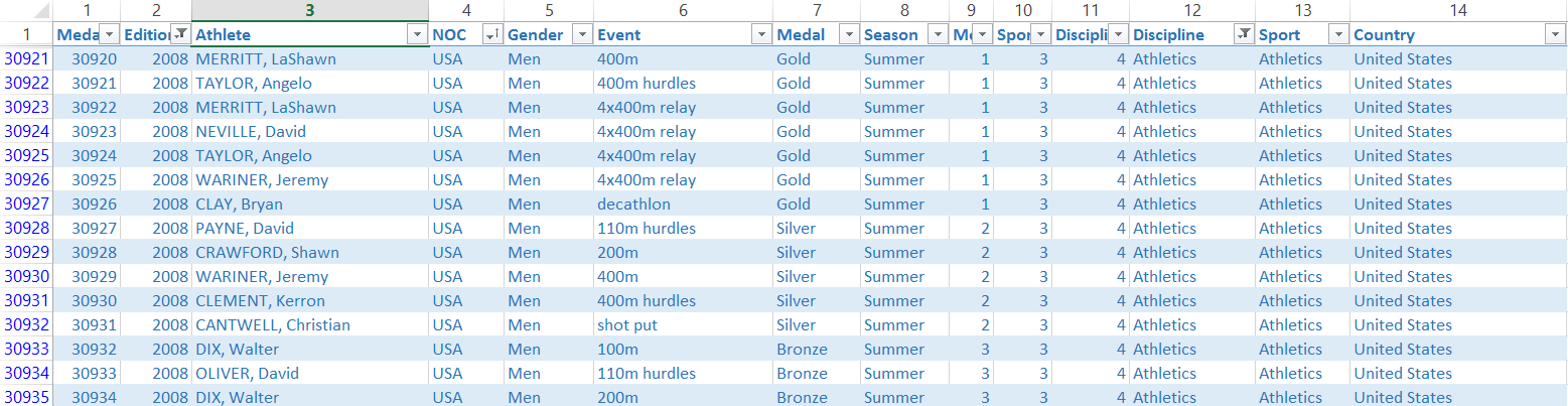
I have used the same Excel workbook of Olympics medal winners on Github at https://github.com/Microsoft/sql-server-samples/releases/tag/adventureworks, but I added a table of Olympic Committee NOC codes, and expanded the medallists table to include the full country name, along with the text for the discipline and sport ids.
Creating Shape Data Rows
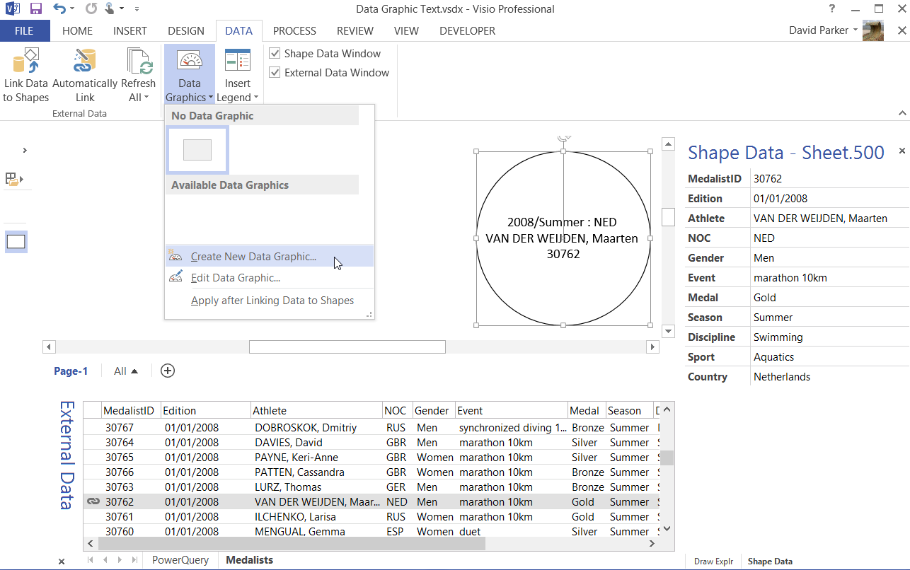
I again used the Link Data to Shapes feature of Visio Professional and used it to automatically create Shape Data rows on a simple rectangle, into which I used INSERT \ Field to simply display customized text on the rectangle from five of the Shape Data row values. The custom formula that I used was:
=FORMAT(Prop._VisDM_Edition,"YYYY")&"/"&Prop._VisDM_Season&" : "&Prop._VisDM_NOC&CHAR(13)&CHAR(10)&Prop._VisDM_Athlete&CHAR(13)&CHAR(10)&Prop._VisDM_MedalistId
In the above formula, the date value for the Edition has been formatted to display just the year. The CHAR(n) function displays the text version of the ANSI (ASCII) number, where the most common ones used in Visio formulas are TAB (9), Carriage Return (13) and Line Feed (10). See http://www.theasciicode.com.ar/ for a full list.
I could use this technique to insert more lines of text, and choose the formatting to apply, but the Data Graphics Text feature provides some useful preformatted options to select from.
Note that the _VisDM_ prefix to the Shape Data row names is a feature of the Link Data to Shapes function.
Creating Data Graphics
I set the Default position to Horizontal = Center and Vertical = Middle, and ticked Hide shape text when data graphic is applied.
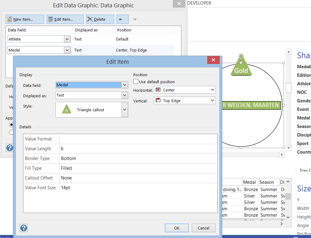
Then I clicked New Item on the New Data Graphic dialog, where I then chose Athlete from the Data Field drop-down list, and selected Text in the Displayed as dropdown. I then reviewed the available built-in text styles.
Text graphic items
Some of the text styles have the option to display both the label and the value, whilst some just display the value. A couple of them, Triangle callout and Circle callout, set their width to the number of characters expected.
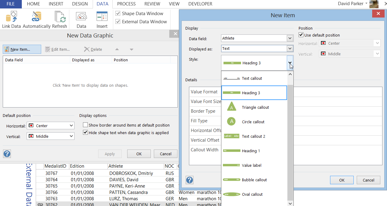
I decided that the Heading 3 style was the most appropriate for the name of the medal-winning athlete.
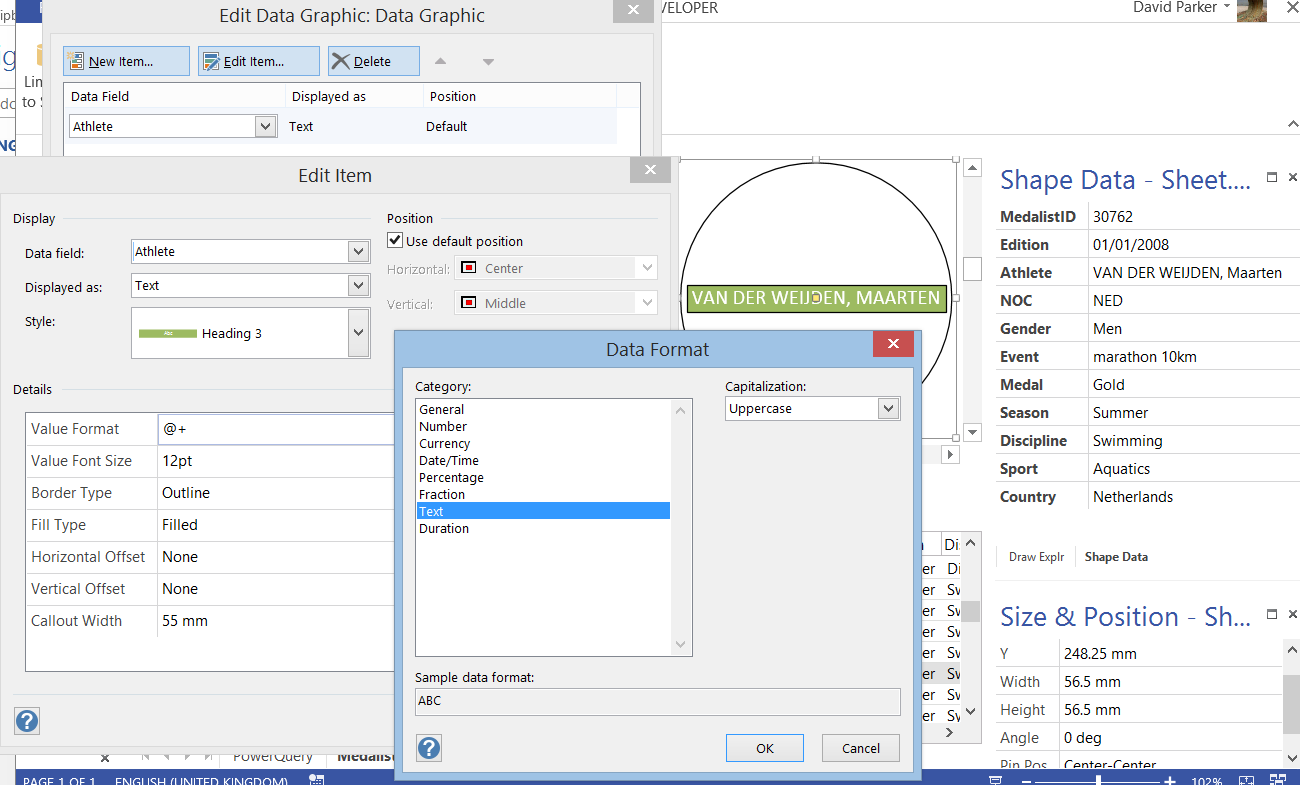
The Details panel then displays the appropriate properties for the selected style, which in this case does not include options for a label.
I decided that the name would be best displayed as capitals by using the Data Format dialog that is opened with the builder button at the far right of the Value Format box.
 I
increased the Value Font Size and chose to have an Outline for the Border Type. I left the Fill Type as Filled, and both the Horizontal Offset and Vertical Offset as None. Leaving
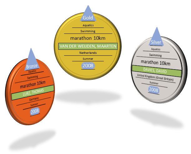
the Callout Width as 0 would mean that it will be the same width as the shape, but I changed it to 55 mm in order to be just narrower than the circle diameter.I then added the Medal type as a Triangular callout at the Top Edge of the circle. I entered 6 as the Value Length because Silver is the longest word of the three options with six letters. I changed the Border Type to Bottom and increased the Value Font Size.
I
increased the Value Font Size and chose to have an Outline for the Border Type. I left the Fill Type as Filled, and both the Horizontal Offset and Vertical Offset as None. Leaving
the Callout Width as 0 would mean that it will be the same width as the shape, but I changed it to 55 mm in order to be just narrower than the circle diameter.I then added the Medal type as a Triangular callout at the Top Edge of the circle. I entered 6 as the Value Length because Silver is the longest word of the three options with six letters. I changed the Border Type to Bottom and increased the Value Font Size.
I repeated the above process for the Silver and Bronze Shape Data rows, displaying all three at the Default position that I changed to Center \ Below Shape. I also ticked the Show border around items at default position for an extra background to these data bars.
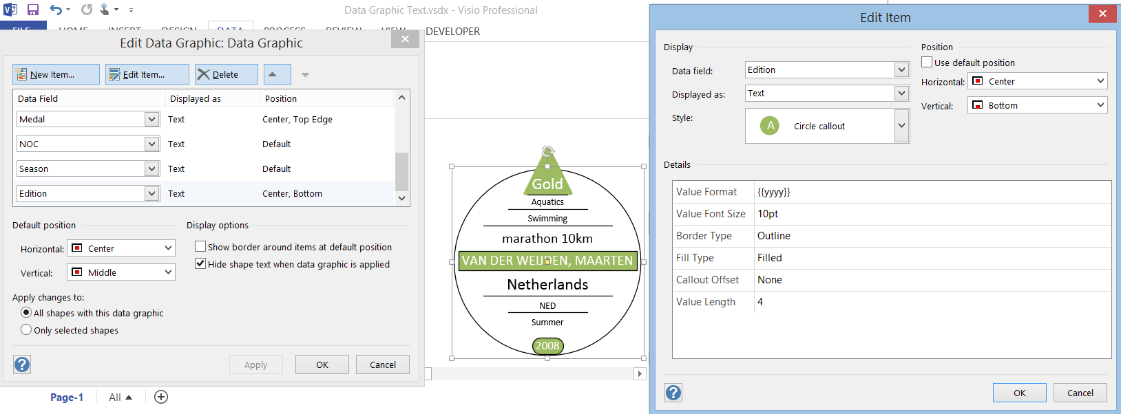
Many Text items can be placed ostensibly at the same position, but their order can be changed with the up and down arrows at the top of the Edit Data Graphic dialog.
Color By Value
I wanted my circle shapes to be colored according to the medal type, so I decided to use the final Data Graphic type, Color By Value, to do this.
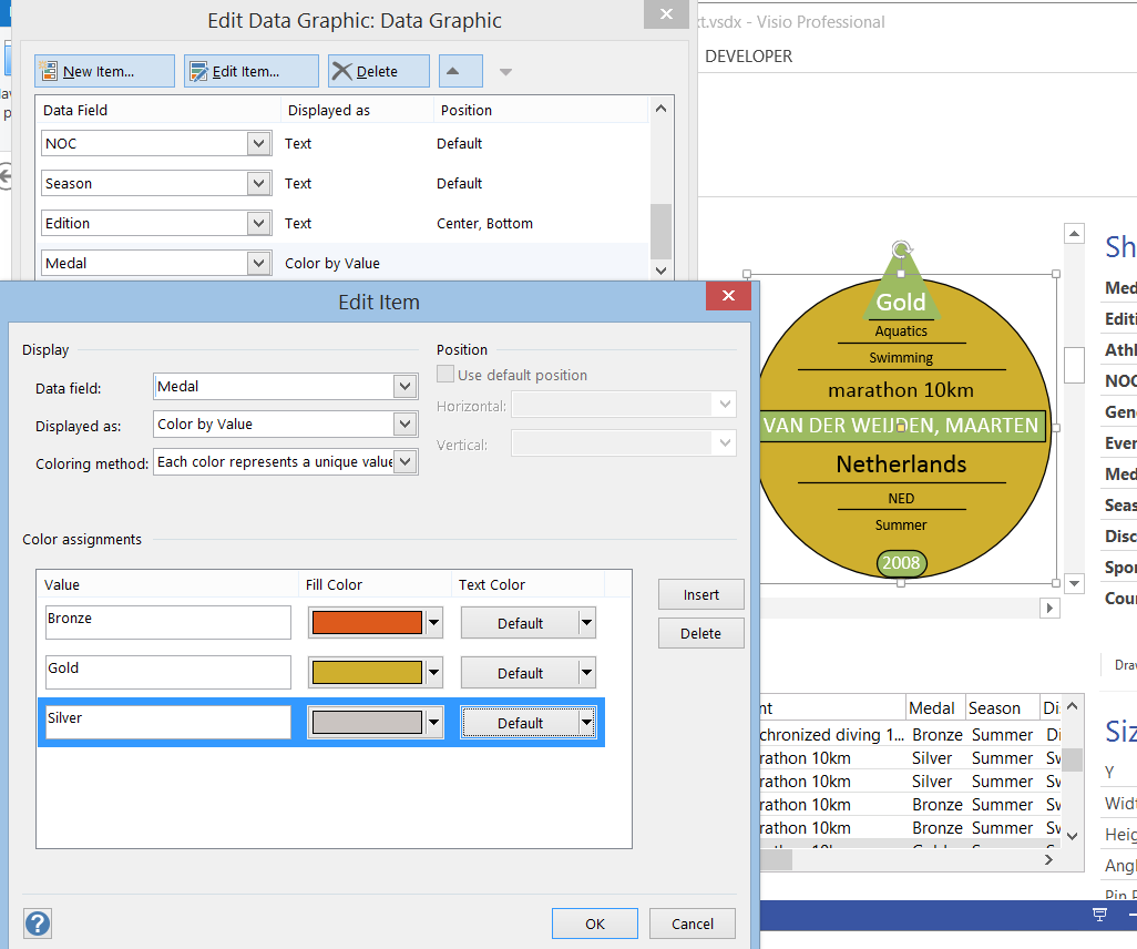
Note that there is only one Coloring method: Each color represents a unique value, available for text, but there is a second one, Each color represents a range of values, if the Data field is numeric, currency, date
or duration.
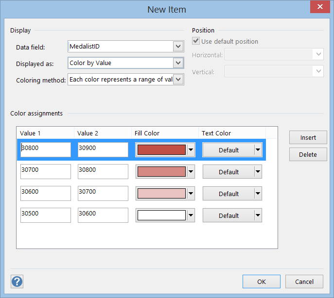
You can edit the range values and the associated fill and text colors.
Note that you can only have one Color By Value operating on a shape at any one time.
Completing the medals
I continued to test alternative text positions and text widths until I was content with the layout on my medal. I also wanted to prevent theme colors from being applied to these particular shapes, and so unticked Allow Themes on the HOME \ Shape Styles dropdown with each one selected, otherwise the fill, lines and font would be subject to theme colors and effects.
Instead, I sub-selected the triangle and circle (which is more like an ellipse because of the number of characters), and changed the fill color. Finally, I enhanced my circle with Shadow, Bevel and 3-D Rotation effects to make it look like a medal.
Summary
In this article, I have shown how to use the Data Graphic Text with shapes that have Shape Data, and how to vary the colors used within them. These text items are just normal Visio shapes, and it is possible to make custom text items with standard vector geometry. This will be the subject of a future article.