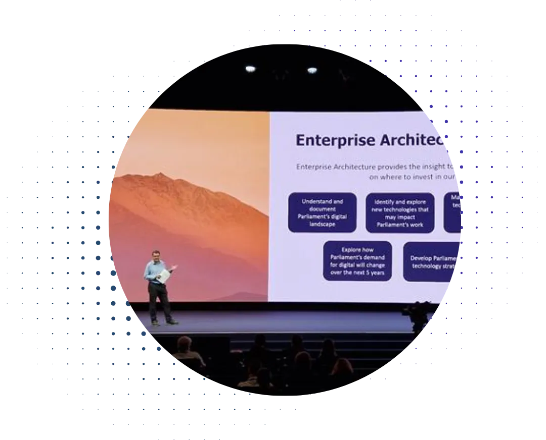

When you have multiple teams working and you need to establish a common understanding, diagrams can be an invaluable tool, especially when people are pressed for time. Today I'm going to relate one example.
Takeaway: a picture paints a thousand words, but it can often take as much time as writing a thousand words. The difference is, people will look at the diagram when they won't read the words.
The situation was that a client was rolling out a new architecture practice. Part of this involves how you structure the repository, and part of that involves discussing things like release cycles and so on (for reasons that I will examine in a white paper later this year).
The interesting quirk in this case was that the infrastructure group (including environmental software like Active Directory) was based on the USA West Coast, while the applications group were based in Europe. Before the implementation of the architecture practice, they had not coordinated at all. The client established a working group with weekly conference calls and an email distribution list.
The first call was... interesting, in that the two groups seemed to be talking different languages. The infrastructure group talked in terms of how each project released when ready, while the applications group talked about how they staged their projects into two test-beds, called Silver and Gold, before releasing everything at once in a quarterly major release or a monthly minor release. The test-beds were refreshed with the same environmental software as production on an irregular basis. They argued that they would like to manage the draft architectures in the same paradigm. So, we created the following diagram to show the key points, as a start for discussion.
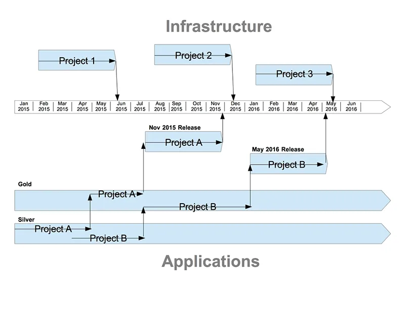
There's a few points about the format of this diagram. First of all, we thought about creating this using ArchiMate, but decided that since the group was almost all new to ArchiMate, their attempts to understand the usage of the language would distract from the discussion. The next point is that the key point is about timing, so it was created as a timeline-style diagram.
Takeaway: Consider what the key message of the diagram to decide how to format it. Dan Roam's excellent book, “The Back of the Napkin” is a helpful resource here.
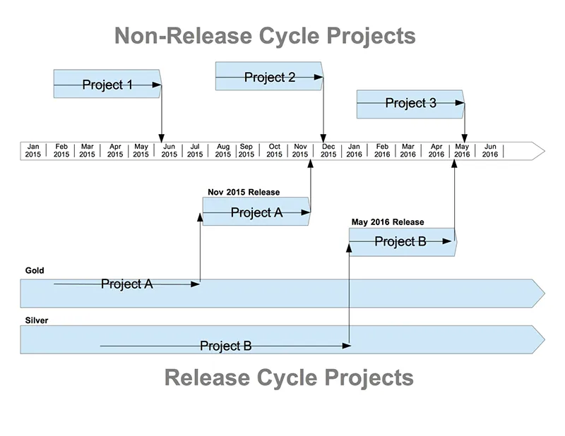
At the next meeting we had a couple of bombshells. First of all, one of the infrastructure members spoke up and explained that all identity management releases coordinated with the applications group release cycle. The second was the revelation that the two test-beds were not used sequentially, but Silver was used for minor releases and Gold for major. This led us to the following diagram.
At this point there was an agreement that this described the current state. Next came the discussion on any changes to make, and how this should look in the repository. The infrastructure group stated that they were willing to adopt the monthly/quarterly release cycle... but then we questioned the use of Silver and Gold draft architectures – why should the architecture drafts be separated? The two test-beds existed for software testing, and there were two because of the effort to perform a refresh – architecture is at a higher level. The applications group conceded the point (eventually). Which meant that we finished with this diagram..
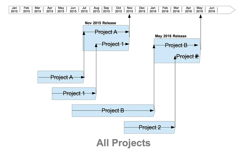
With this diagram in place it was fairly easy to design the structure. We have an area for each project, and an area for each release. Projects start off in their own area, after architecture review they get merged into a specific release.
The point about this diagram is that it managed to serve as a focal point for discussion, which had been somewhat aimless until then – it puts a stake in the ground that people have to either accept or argue – whereas it is possible to get lost in the verbiage of a text. It may initially take more time to create the diagram, but in the long run it saves time.

.webp)