


Pivot Diagrams in Visio
Most Microsoft Excel users are aware of the power of pivot tables and pivot charts, but how many Microsoft Visio users are aware of the power of Pivot Diagrams? There are so many ways of pivoting the data in tables in order to aggregate numerical data values by selected categories.
Sample Excel Workbook
Microsoft Visio is installed with a sample Microsoft Excel workbook called OrgData.xls, which is installed into the language folder in the Visio Content folder, as below.

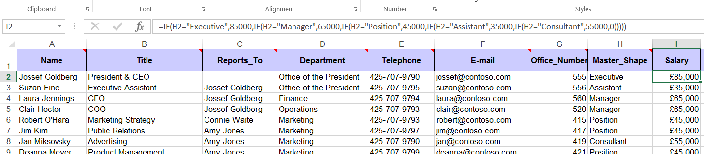
Note that this is an old version of Microsoft Excel workbook with an xls extension. I opened this and saved it as a newer Excel version with the xlsx extension in a folder where I could edit it. Sheet 1 in the workbook contains a table of example employee data with the following column headers that are intended for use with the OrgChart Wizard in Visio:
The Master_Shape values are used by the OrgChart Wizard to select the relevant shape, but I decided to use them as the job grade in order to create a salary value in a new column called Salary, which I formatted as Currency. Accordingly, I entered the following formula in cell I2, and then copied it down to the end of the table.
=IF(H2="Executive",85000,IF(H2="Manager",65000,IF(H2="Position",45000,IF(H2="Assistant",35000,IF(H2="Consultant",55000,0)))))
I added this extra column so that I could have some numeric data to play with.
Excel Pivot Tables and Charts
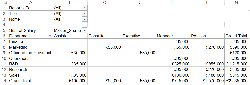
So, I can easily insert a pivot table in Excel from this table in order to sum the Salary per Department, per Master_Shape:
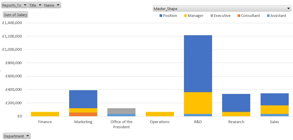
I can display the same data as a pivot chart too:
These visualizations are familiar and useful but there are less familiar and perhaps more useful options because I have Microsoft Visio Professional.
Pivot Diagrams in Visio
Selecting the data
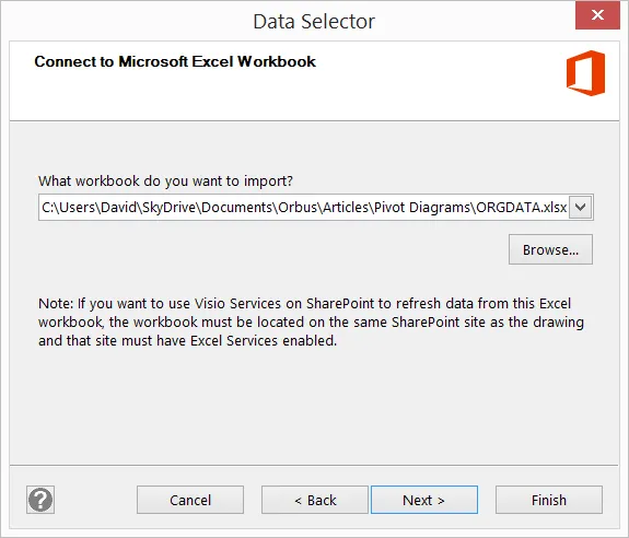
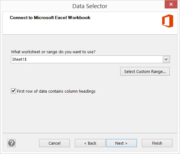
Choosing to create a Pivot Diagram from the Business category of templates will start the Data Selector wizard.
1. Create a PivotDiagram

2. Select Microsoft Excel workbook as the data source

3. Browse for the Sample workbook
4. Select Sheet
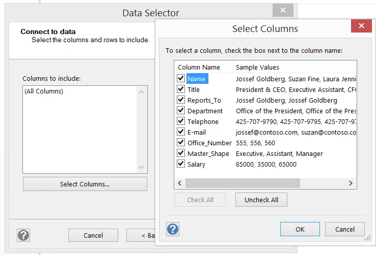
5. It is possible to unclick some columns using Select Columns...
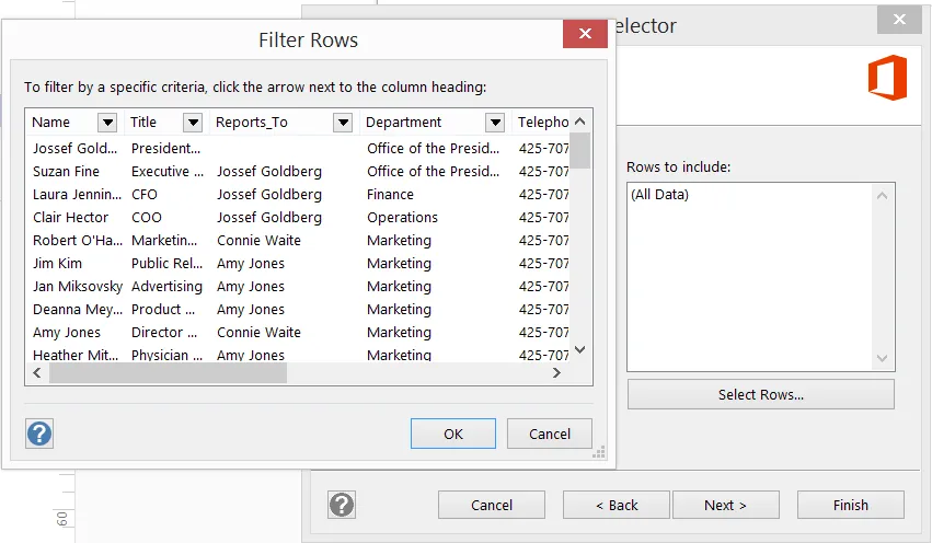
6. It is also possible to filter rows with Select Rows...
Laying out the nodes
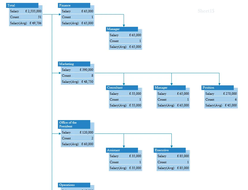
The Total node is automatically inserted in the top left corner of the page. In this case the PivotDiagram add-on has incorrectly guessed that I would like to sum the Office_Number values:

I changed this to display the Salary(Sum) and the Count in the Add Total panel on the left-hand side. However, I also wanted to display the average salary, which was not listed in that panel, so I used Edit Data Graphic which is available from the PIVOT DIAGRAM or DATA ribbon tab. I clicked New Item on the Edit Data Graphic dialog, then chose Salary(Avg) as the Data field, and amended the Value format as 0 places as Currency Category.

This added the extra row on the node display, and then I broke down the diagram by using the Add Category menu option to select Department first, and then Master_Shape.

I then used the PIVOT DIAGRAM / Layout / Direction / Left–to-Right with the Total node selected, followed by PIVOT DIAGRAM / Layout / Direction / Top-to-Bottom with all of the Department nodes selected. Finally, I used PIVOT DIAGRAM / Layout / Re-Layout All to ensure that the spacing between nodes was re-established.
Enhancing the diagram
There are more opportunities to enhance the pivot diagram by using PIVOT DIAGRAM / Format / Apply Shape, as in the first two columns below, and PIVOT DIAGRAM / Format / Edit Data Graphic to add Data by Value and Icon Sets, as in the rest of the diagram. I used DATA \ Display Data \ Insert Legend in order to explain the colors and icons used. I also added a Data Bar above each node as a Data Graphic item in order to indicate the total salary cost for each node.

Summary
The resulting pivot diagram is certainly a more visual display of the data in this worksheet than the pivot tables and pivot charts in Excel. It may not be suitable for quick simple summaries, but it is certainly worth considering for many situations where the extra depth of detail available, and refinement of graphical appearance, will aid the speedy comprehension of complex information.

.webp)
