

Architectural Context Diagrams
I frequently get questions from clients about Architectural or Architecture Context diagrams. The most common dilemma is: what to include and what not to include? An architecture context diagram is one of the most useful work products; it is especially useful at the outset of a project as it can establish the scene, set expectations, and even determine the outcomes of a project.
I had to rescue an EA team recently because a weak architecture context diagram had caused no end of misunderstandings among sponsors and stakeholders. The diagram implied that requirements could be met with only a few simple changes to the application landscape; in reality, it also needed infrastructural changes and business process changes, but these had been totally left out of the original drawing. Eventually we managed to resolve the mix-up and explain what was really needed and how the mistake had been made... but it wasn’t an easy problem to resolve!
I would go as far as to say that Architecture Context diagrams often cause unnecessary disagreements and rows. Why are good diagrams so hard to produce? Well the simple answer is that they are often a drawing that shows some of the components making up a system (system here in the broad sense – i.e. not just IT), but they miss out the context. So here are two tips that I use to ensure that you end up with a better diagram.
The first point is to make sure that your diagram covers an architectural perspective. A system context diagram shows components that might be relevant to an architectural design, but it may not explicitly show what this means in terms of problems with the current architecture or improvements delivered by a future architecture. Let’s take an example, summarized in Diagram 1: Architecture Context Diagram.
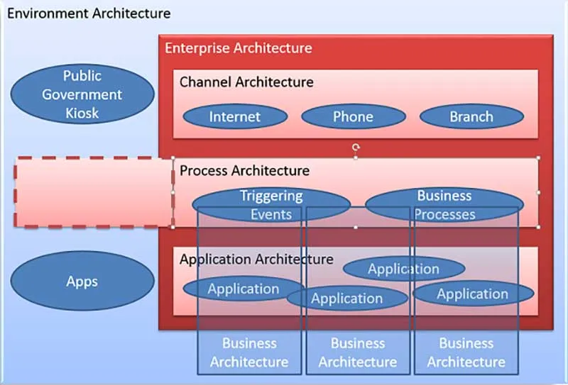
Business leaders at a bank wanted the organization to be more responsive to customer needs, and in particular they wanted to be able to respond better to customer interactions. Customer feedback reported time and again that customers found contacting the bank difficult, and that they received a different response as they approached the bank across different channels. Diagram 1 doesn’t show any of the client specific content, but it shows the three key channels – Internet, Phone and Branch – forming the Channel Architecture; it shows that the Process Architecture comprises a number of Triggering Events that initiate various Business Processes; and it shows several Applications making up the Application Architecture. Each of these architectures is shown in the context of the related architectures – so customers contact the bank through one of the channels, each contact triggers one of more business processes, and these are supported by the applications. All three architectures are shown in the context of the Enterprise Architecture.
The team also wanted to show that viewed from the perspective of the Business Architecture, there were processes and applications that were unique to particular business units or products. They showed this through a number of Business Architecture columns that cut vertically across the enterprise-wide Process and Application Architectures.
A key point in this diagram is that every component was shown in its context. IT only existed because it was useful in a business or management context. The business architectures existed in the context of a legal organization. Processes existed in a business process context that included triggering events, products, business rules, applications and outcomes. I could go on, but the point to remember is that every architectural component exists in one or more contexts; and each context exists in an even bigger context. So the IT context supports one or more Business contexts, within an Organization context, which exists within an Environmental or Social context.
Realizing this point, the EA team expanded their context from Enterprise Architecture to show the Environment context. This made it easier to identify and debate how the environment architecture might support the internal EA initiative. For example, they found that various government bodies are planning public information kiosks, which might be an additional channel outlet for their customers – for example, if a customer wanted to lodge a complaint with an industry ombudsman against the bank. They also added external Apps, for example, to cover Apps that allowed a customer to consolidate information from several bank accounts. Finally they extended their internal Process Architecture to show that, from a customer perspective, the enterprise was merely one of several service providers rather than being the central provider.
The second example of context is based on Business Capability. All business capabilities are based on a range of things.
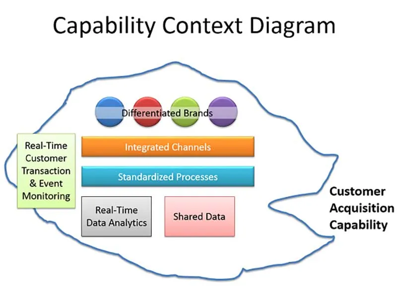
For example, in Diagram 2 I’ve shown a Customer Acquisition Capability, which is dependent on the ability of the enterprise to support a number of differentiated brands, how well it integrates various channels, how well it standardizes customer acquisition processes, the availability of real-time data analytics and shared data, and a talent for real-time customer transaction and event monitoring! In other words, all of these things are necessary, together, to create the required capability. Because a good understanding of capability requires an understanding of all of its constituent parts, a capability context diagram is a great way to show context from a business perspective.
Going back to my original question: what is an architecture context diagram? It is simply a visual that shows the complete context of a proposed architectural change. It must make that context sensible to a range of stakeholders from very diverse backgrounds. If it misses out any part of the context, there is a risk that it will confuse rather than inform. It is always possible to drill down into more detail, but at the highest level putting everything in a Capability and Architecture context works best!

.png)