
I wrote a little while ago about the Innovation Value Institute (IVI) and some of the interesting work that they've done around managing IT capabilities. However, there's one specific visualization that they have which I find to be an excellent example of information visualization, and I'm going to talk about it in detail here.
As I described in the earlier article, the IVI have identified 34 specific capabilities of an enterprise IT organization, and they provide ways to rate the maturity level of the organization in delivering each capability on a scale from 0 to 5. When this is done, it is not only possible to rate the capabilities for each organization, but you can also build an average score across all organizations for each of these IT capabilities, and compare each one to the score for the specific organization.
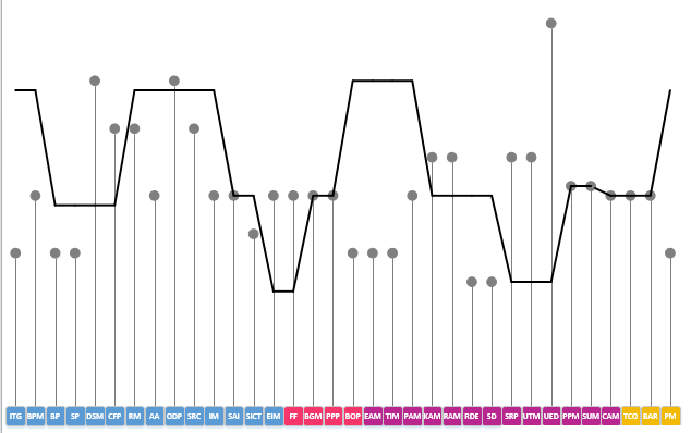
An example of the visualization itself is shown below. Each capability is shown as a box at the bottom of the graphic, listed from left to right. The maturity level for each capability is shown as a solid ball above each capability, connected to it by a line. Meanwhile, the average maturity level for each organization is shown as a continuous line from item to item.
I like this diagram for a couple of reasons.
First of all, I often tell people that a useful way to clarify the mind when creating a diagram is to ask what the elevator statement for the diagram is. In this case, the statement is obvious: “This diagram shows the maturity of our delivery of each of the IVI capabilities, and the average maturity of delivery for other organizations, so that we can compare the two.” The diagram does not do anything else, nor does it attempt to.
The second thing I like is how it lends itself to deriving insights from the diagram. In the example shown, there are two regions where the maturity level for the organization clearly deviates from the average. In the first case, the organizational maturity is noticeably below the industry average. In the second case, it's noticeably above the industry average.
Each of these is a potential cause for concern and warrants investigation. Where capabilities are less mature than the average, this might indicate that not enough effort is being invested in that area... but perhaps for the capabilities that are noticeably more mature than the industry average, too much effort is being devoted to them, and the organization might see a return from focusing on other areas.
Of course, you can rearrange the order of the capabilities to create such gaps, but the diagram as shown lists the capabilities in the groupings and order that the IVI have identified – which puts similar capabilities together – so that gaps like this are more likely to be obvious.
So in summary, the reason why I like this visualization so much is that it does one thing, and does it very well – calls out the differences in maturity levels for IT capabilities between an organization and the industry average.
There are a couple of ways that this visualization could be extended. First of all, there is only a single line showing the average maturity value for all organizations. You could easily have different lines showing the values for that sector or geography, as the importance of a given capability could be different as those two dimensions vary.
Second, you could also show multiple values for the organization-specific maturity values over time – showing how the maturity levels have improved. Alternatively, this could be shown by lines, similar to the way that industry average maturity is shown.