
One of the landscape diagrams that is at once most useful and most difficult to create is a migration diagram - a diagram that shows a set of work items for an area (a project, a business unit, etc.), along with what applications and hardware they affect, and what capabilities they change or add. In keeping with the theme in this series, the elevator statement for the migration diagram is:
“This diagram shows each project for the area, the assets that it affects, and the capabilities that they deliver”
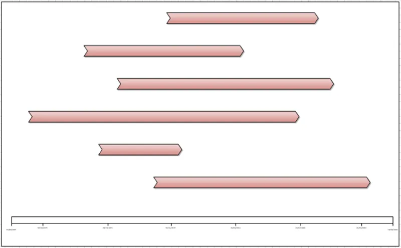
The centerpiece of this diagram is, of course the work items themselves, and we start by placing them in the center of the diagram. It’s useful to the consumer of the diagram to display the relative timelines of the work items, so we can arrange them as in a timeline fashion, as seen below. This allows the consumers of the diagram to see which work items will be taking place at the same time.
The next components of the diagram that we place are the capabilities that it affects. In western cultures we read from left to right, so the natural placement is to show the current state capabilities on the left of the work items, and the end state capabilities on the right –this mimics the natural reading order of the audience. To enable clear tracing, we’ll add in grouping rectangles that are connected to each work item.
A given capability might be affected by multiple work items, in which case we’ll show the capabilities flowing over multiple grouping bubbles. The end result looks like this, with the capabilities shown by the yellow boxes;
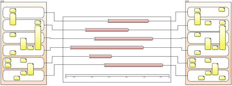
The remaining aspect of the diagram shows the applications that are affected by the work items, and then the infrastructure items that are affected by the work items. Here we’ll use the same grouping rectangles as for the capabilities. However, we do face a challenge at this point in that if we have connectors from the work items in the center, there will be a lot of crossing lines.
Crossing lines is one of the main factors that will complicate a diagram, so in this case my recommendation is not to link the work items to the rectangles via connectors, but instead use clear and corresponding labeling to make it clear that the leftmost rectangle represents the topmost work item in the center, the second from the left represents the second work item from the top in the center, and so on. You should only use a diagramming element to add clarity, and in this case using connectors would not add clarity.
Adopting this approach gives us a finished migration landscape diagram as seen below.
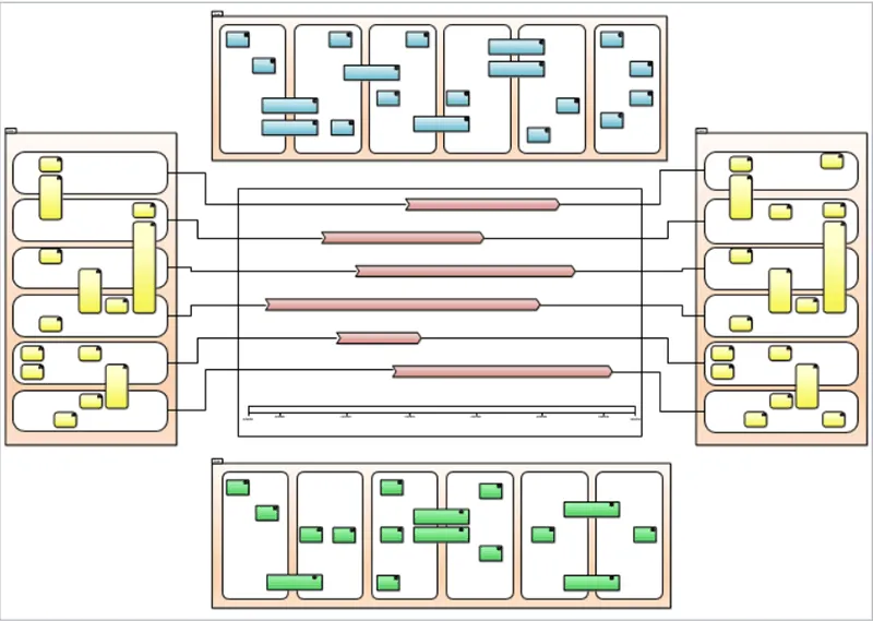
This particular diagram is one of the most interesting that we will consider. First of all, it’s probably the furthest from a traditional modeling diagram as might normally be produced as part of a project. However at the same time, while it takes a fair amount of work to create, it is also one of the most effective of the landscape diagrams that we consider.
Read on for part five, where we'll cover the Application Inventory.

.webp)