The first BPMN diagram that I ever created provoked an interesting bit of feedback. I was nervous about getting the start and end events rights, or getting the gateways correct, but it seems like I need not have worried, because those were not the things that resulted in criticism. Instead, I got criticized for using the default shapes. Specifically, what I got was “Can you look at the color you’re using for the shapes – that dull grey is a bit yawno!”
Hmm. Since then, I’ve learned that this is more often the reaction to diagrams than I’d like, it’s seems like it’s more important that the diagram looks pretty than it conveys correct information. Style over substance. What I’ve come to realize is that this reaction is rooted in some genuine concerns, but the problem is actually that this concerns are unconscious, and so get applied incorrectly at times.
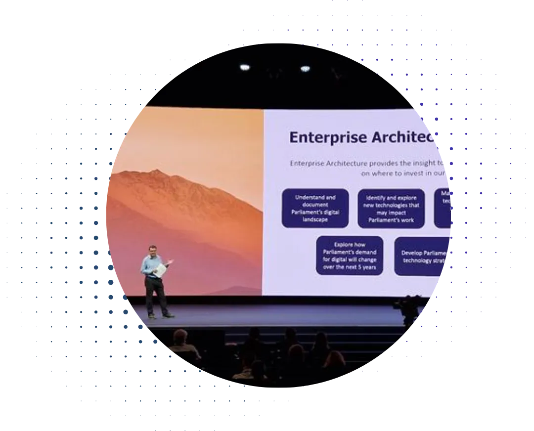
We can blame PowerPoint, one of the traditional minor villains of the organizational world. We’ve all sat through a soul-crushing sequence of dull bullet point slides, often delivered in a dull monotone that could be used as hospital-grade anesthetic. Pity a thought then, for the executives who receive this more than the rest of us.
When you’re presenting to someone who has to sit though presentation after presentation after presentation, then it does become important to keep them awake, and that’s why some kinds of diagram – the ones targeted to the high-level stakeholders – need to be more entertaining and more alive. It’s just that not every diagram needs to be like that, because not every diagram is pitched at a high-level stakeholder whose job consists of a sequence of short meetings on a wide range of subjects. You have to fit the message to the audience.
In particular, another kind of stakeholder is highly detail-focused and will explicitly want to see (or at least know) that there is real substance underlying the recommendations being made. For such stakeholders, ‘pretty’ diagrams can be counterproductive, especially if the prettiness comes at the expense of information content.
What this builds up to is that you need to fit the presentation to the audience – the desire for ‘pretty’ diagrams comes from a highly sensible desire not to bore high-level stakeholders who see a dozen presentations a week. The problem comes because this mindset then gets applied to all diagrams, even when this is not so important. Different diagrams for different audiences is the key point here.
A good example exists in the Department of Defense Architecture Framework, or DODAF. One of their viewpoints is OV-1, which is supposed to give an overview of the concept, like the example below:

Universal High-Level Concept Graphic (Operational View OV-1), DODAF
Quite attractive, even impressive, but not much that can be argued with. And yet many other DODAF viewpoints use a highly structured meta-model that looks more like the ArchiMate, TOGAF and UML diagrams that architects often find more useful.
So, just as it’s important to create multiple viewpoints that each address the varied concerns of different stakeholders, it’s important to match the presentation of that viewpoint to the stakeholder themselves. It’s not a one-size fits all situation, unfortunately.


.png)

.webp)
