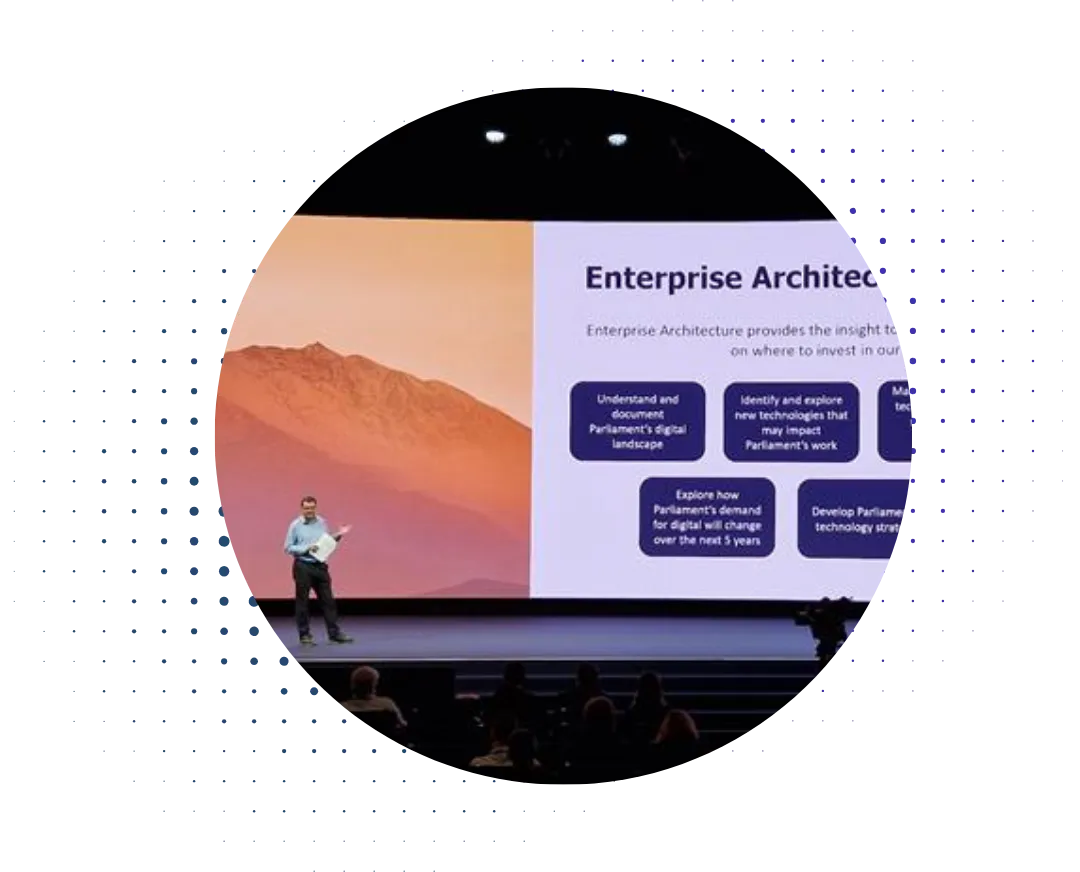

There are a number of items that an organization buys when setting up an architecture modeling practice. TOGAF training, possibly a modeling tool, and so on. The one item that you don’t expect is a plotter, for printing all those huge A0 diagrams that we seem to see in a lot of architecture departments. Usually they’re called landscape maps, and that’s the term that I’ll adopt here.
Now, historically, Orbus Software (and myself) have not been fans of such diagrams. Witness David Jones’ webinar and white paper on the subject. Simply put, it’s often hard to find information on diagrams that large and complex, both when reading them and when maintaining them. Often, they verge on being cousins to the infamous PowerPoint slide (see image) that prompted the US commander in Afghanistan to quip “When we understand that slide, we’ll have won the war.”
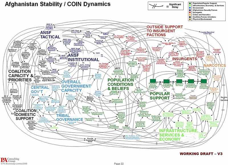
Not very useful – and yet still chief architects love them. But if they don’t provide information, then why bother even spending the time? After many years I’ve come to the conclusion that there is one specific way in which such ‘wall hanging’ diagrams do actually provide information. They look impressive, especially to management. Especially to senior management.
To state an obvious but often forgotten truth - senior executives are overloaded. They go from meeting to meeting to meeting processing presentations on several dozen different topics. Switching from topic to topic to topic can make the keenest mind punch-drunk, so anything that is easily digestible becomes a godsend. And this is where the huge landscape maps come in.
Presenting all this information in a landscape map to senior executives kills two birds with one stone. First, it visually shows the sheer quantity of information involved, which is often a surprise to anyone who doesn’t work in IT and only thinks about the systems and processes that they interact with. Second, because they present details; they enable the executive to probe more deeply in randomly selected areas and validate that this isn’t just some made-up charade.
So this means that such landscape maps have value in that they offer a tangible, explainable artifact that has substance (the amount of information contained) and structure – targeted purely at senior executives. And that is the value that they add – reassuring business leadership enough that they give necessary space to the effort.
I’m guessing that to many, this will seem a horrifyingly cynical position to take. It feels like surrendering to politics, or facilitating executive ignorance. But bluntly it’s a question of tradeoffs. I create one of these landscape maps in a day once you include interruptions, admin overhead and so on. But the information that you need to (truthfully) create one is also information that the architecture team would use in more effective work – it’s just that the landscape diagram serves the purpose of reassuring these busy senior executives who wonder “what do those people do anyway?” So for the sacrifice of a day, you create an artefact that greatly facilitates buy-in at the top levels.
At this point I’m going to reference the Lord of the Rings films – I’m going to simply take the risk that a large proportion of the audience for this blog have watched them. In the second film, there’s a scene where Frodo, Sam and their guide Gollum observe an army on the march. Gollum tells Frodo and Sam “The Southrons. Very bad men.” What’s interesting is when you listen to the director’s commentary, where he mentions that he had to add that line in to satisfy studio executives. Otherwise, the executives felt, how could the viewer know whether the army they were watching was the good guys or the bad guys (especially once the ambush from Faramir’s rangers begins)?
Seems strange, but it was what amounted to a minor compromise to help enable an entire film. So really, this was Peter Jackson practising stakeholder management. In the same way, Enterprise Architects need to practice stakeholder management, and creating such landscape maps while seeming pointless at first glance, can be a very effective way of stakeholder management in terms of reassuring executives.
Over the next six posts, I’m going to consider six common landscape maps and offer observations on best practices in creating such diagrams, as well as how to make them as digestible as possible within the constraints and challenges that they pose. These will be:
- Process Landscape
- Product Realization Diagram
- Migration Diagram
- Application Inventory
- Application Communication Diagram
- Deployment Diagram
The precise techniques will vary from diagram to diagram, but in general we can apply one single principle. Every diagram is meant to convey information, so in each case we will ask two questions to guide us:
- What question does this diagram answer?
- What elements does it need to display?
And finally, we'll discuss a few alternative approaches to these large diagrams.
First up, process landscape...

.webp)